
For me, the VW ID. Buzz is a good example of how strongly software and UX now shape the perception of a car. The space concept, design and driving experience can be convincing — and yet the overall experience can still feel unnecessarily complicated in many small moments. That is what this report is about: ID. Buzz software, infotainment, controls and why automotive UX is no longer a side issue.
In the past, a car was mainly judged by its engine, chassis, build quality, space and design. Modern vehicles, by contrast, are digital products: navigation, climate control, media, driver assistance, charging planning, vehicle settings and numerous comfort functions all run through software. The interface therefore becomes a central part of the customer experience — and poor interaction logic can noticeably hold back an otherwise very good product.
My VW ID. Buzz Experience in Brief
- The vehicle itself convinces me much more than its everyday software and interaction logic.
- Many problems do not come from one major failure, but from recurring extra clicks, overlays and confirmations.
- In the ID. Buzz, touchscreen controls, assistance systems, infotainment and vehicle logic all converge on one central interface.
- That is exactly why in-car UX becomes part of product quality, safety and brand perception.
Important: The specific examples refer to my own VW ID. Buzz, my software version and my everyday use. Software versions and equipment may differ.
VW ID. Buzz and Modern Cars: The Car Has Become a Digital Product
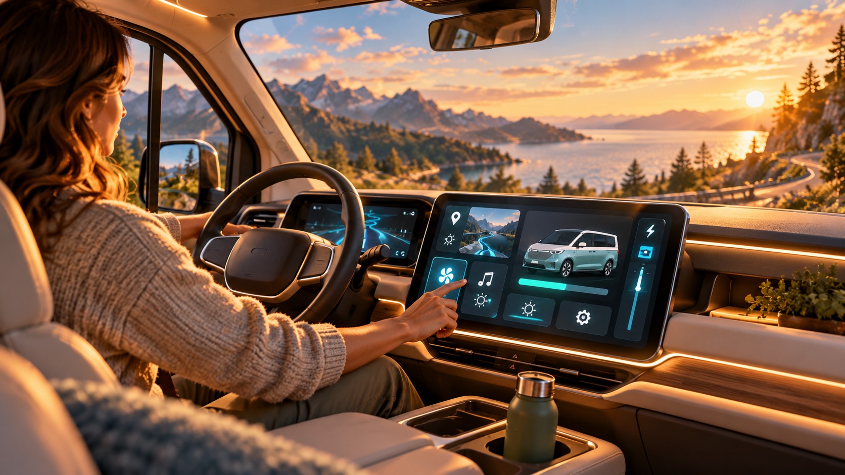
In traditional vehicles, function and control were usually directly connected. If I wanted to change the temperature, I turned a dial. If I wanted to adjust the volume, I reached for a knob. After a short time, many functions could be operated almost without looking because position, haptics and function were linked.
In a modern car, however, a software layer increasingly sits between the user and the function. A simple action can suddenly mean looking at a display, finding the right area, opening a menu and then choosing the desired setting. That is perfectly fine for functions used only rarely. It becomes problematic when frequently used functions require the same path.
What Good Automotive UX Needs to Achieve
- make frequently used functions accessible in as few steps as possible,
- make states and feedback clear and immediately understandable,
- use touch only where visual attention is acceptable,
- combine physical and digital controls according to the usage context.
This is not about treating touchscreens as inherently bad and physical controls as inherently good. The usage context is what matters. I can look at a smartphone while operating it. In a moving car, my attention should remain on the road as much as possible. That is why interaction design requirements are different there. Frequent functions need to be quickly accessible, states clearly communicated and controls placed where users expect them.
What means three extra clicks at a desk can require several additional seconds of attention while driving. Automotive UX is therefore not simply smartphone UX on a larger display.
ID. Buzz Software and Infotainment: Good Hardware Cannot Compensate for Poor UX
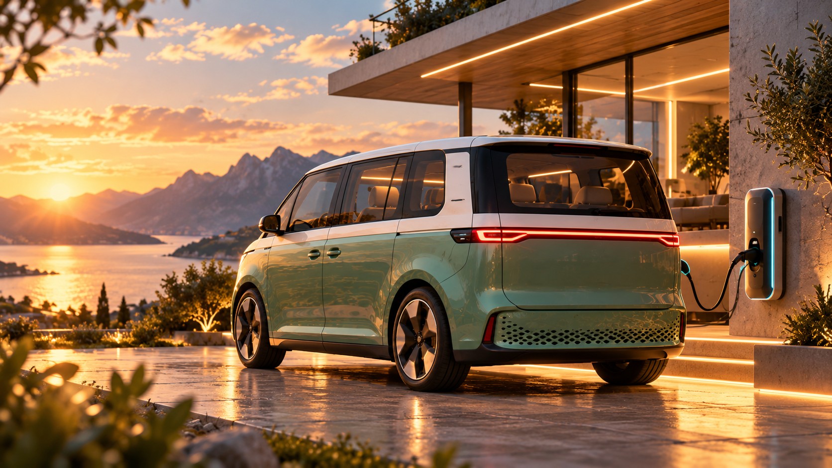
The VW ID. Buzz shows the conflict between strong hardware and a weaker digital experience particularly clearly. The space concept is excellent, the vehicle drives pleasantly and has a distinctive identity. That is precisely why problems with ID. Buzz software, infotainment and controls stand out even more in everyday use.
Volkswagen has significantly improved the software of its ID. models over the past few years. In the current ID. Buzz, infotainment has moved to a 12.9-inch touchscreen and a new system generation and the previously unlit touch controls for temperature and volume have also been revised. At the same time, a recent Autocar review describes the system as significantly faster, but continues to criticize the layout and haptic sliders. This is where fundamental UX issues remain: some functions are located where users would not intuitively expect them, menus are nested and some interactions require unnecessary intermediate steps.
This is an important distinction: performance is not the same as user experience. A menu can respond technically within milliseconds and still be poorly designed. If I first have to think about where a particular setting is located, friction exists regardless of how fast the software runs.
For the manufacturer, there may be different systems and responsibilities: infotainment, vehicle software, hardware, app, navigation or assistance systems. For the user, this separation does not exist. They experience a single product. If the car drives brilliantly but everyday operation is annoying, the perception is not “the infotainment department has a problem,” but simply: “the car is annoying.”
Experience Report
My VW ID. Buzz Experience in Everyday Use: Nine UX Problems That Matter Every Day
These small moments show me how strongly software now shapes the entire car. None of the following points is a complete failure on its own. But each costs attention, creates an additional step or conflicts with an expectation built up through years of driving. Together, they create a noticeably worse customer experience.
ID. Buzz Reverse Gear: The Central Interface Is Practically Blocked
When I reverse out of my driveway, I cannot continue using the central interface normally. Yet that may be exactly the moment when I want to change the heating, select a radio station or perform another simple action. In a traditional car, that would have meant reaching for a physical control. In the ID. Buzz, these functions run through the same display — and that display is not available to me in the usual way in this situation.
UX issue: A safety logic blocks not only risky actions but also mundane everyday actions, making the centralized control concept particularly noticeable.
ID. Buzz Parking Sensors: Too Many Warnings, Too Much Overlay
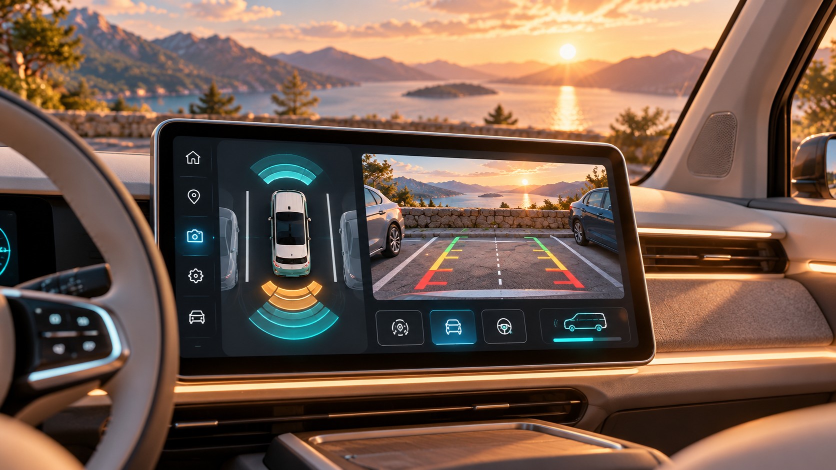
In my vehicle, the parking sensors feel too frequent and too early in everyday use. As soon as park-distance control activates, a large overlay also covers the interface. It feels as if roughly a third of the usable screen area is occupied — precisely when I might want to operate something else.
UX issue: An assistance system creates not only acoustic friction but also visually takes over a large part of the central interface.
ID. Buzz Heating: A Basic Function Requires Opening the Climate Menu
In the normal main menu, I cannot simply switch the heating on or off with a permanently visible control. I first have to open the climate menu and find the actual on/off switch there. Particularly irritating: when I park the vehicle, a small shortcut suddenly appears at the bottom that allows climate control to be switched directly.
UX issue: The software shows that a direct shortcut is technically possible — but does not keep it permanently available during normal use.
ID. Buzz Navigation: A Basic Interaction Is Not Immediately Discoverable to Me
I subscribed to the VW navigation package for a trial. After only a short time, I noticed how accustomed I am to a particular interaction from Google Maps: if I move the map, I expect an immediately visible way to recenter it on my current position. In the VW system, I could not find this function right away. Perhaps it exists somewhere — but from a UX perspective, that is already the problem.
UX issue: A frequent map interaction should not require searching through the interface while driving. Lack of discoverability is a failure here even if the function technically exists.
ID. Buzz Radio: One Extra Click on Almost Every Drive
With my current software version, the following regularly happens: I get in, select a radio station — and the system then switches to player mode. I have to switch back to radio again. It is probably simply a bug. For my experience, however, the cause is secondary: the unnecessary interaction repeats over and over.
UX issue: Small bugs with high repetition frequency become more important in everyday use than rare major failures.
Reversing Without a Camera: Seat Sensor and Safety Logic Interact
My ID. Buzz does not have a rear-view camera. During the ordering process, it was not clear to me that I had to configure it separately — which is also part of the customer journey for me. When reversing, I therefore turn around more often. If I lift myself slightly out of the seat, the vehicle apparently no longer detects sufficient weight and interrupts driving. To my knowledge, the relevant function can be disabled, but then has to be dealt with again when starting a new trip.
UX issue: The ordering process, hardware configuration and safety software later meet in everyday use. Customer experience does not end when the vehicle is handed over.
ID. Buzz Phone Tray: A Warning I Have to Confirm Again and Again
If I place my smartphone in the area intended for wireless charging — a feature my vehicle does not have — I regularly see a message that an object has been detected there. Every time, the system requires confirmation with “OK.”
UX issue: The system knows the vehicle configuration, yet repeatedly treats a perfectly expected use of the storage tray as an exception.
ID. Buzz Driver Profile: Confirm It Again at Every Start
I also have to confirm my driver profile again and again when starting. Whether this is due to regulation, privacy requirements or a product decision is initially irrelevant to me as a driver. I simply experience another message that forces an interaction every time I start a drive.
UX issue: Internal or regulatory requirements are passed on to the user unfiltered as a recurring task.
ID. Buzz Rear-View Camera: The Problem Starts in the Ordering Process
The fact that my vehicle has no rear-view camera is not simply a missing hardware option to me. What matters is that during the purchase and configuration process it never became clear how relevant this option would be in my later everyday use. With a large vehicle such as the ID. Buzz, I would have expected this decision to be explained and contextualized much more clearly.
CX issue: Good user experience does not start inside the vehicle. Product configurator, sales consultation, equipment choices and later software form one continuous journey.
As a driver, I initially do not care which department, technical restriction or policy is behind an interaction. I only experience how many additional steps the product demands from me every day.
That is why details like these are not trivial to me. They show why automotive UX is not decided by one major infotainment redesign alone. It is decided in a hundred small situations: What happens when reverse gear is selected? Which information may an overlay cover? Which settings persist? Which shortcut is visible when? And how often does a user have to confirm the same decision again?
VW Changes Its Software Strategy — from Going It Alone to a Partner Model
Volkswagen is realigning its software development and relying more heavily on partnerships — including Rivian for new electrical/electronic and software architectures as well as technology partners in China. This shows how central software and UX have become to the vehicle product itself.
ID. Buzz Controls: Small UX Problems Add Up
For me, the biggest ID. Buzz usability issues are rarely spectacular. They are not necessarily complete system failures, but many small irritations that repeat in daily use:
- a frequently used setting is in an illogical place,
- a function does not remember its previous state,
- status and feedback are not clearly visible,
- touch areas are triggered accidentally,
- a simple action requires several unnecessary interactions.
Each of these points on its own is probably not a reason to reject a car. Together, however, they create persistent friction. And that sum determines how a product is perceived. Several small irritations eventually become “the software is annoying” — and very quickly, “the car is annoying.”
This is a fundamental principle of user experience that goes far beyond cars. Users do not evaluate products from a feature list or from a company’s internal organizational structure. They evaluate the experience that emerges across all touchpoints. An excellent product with ten recurring small UX problems can therefore feel worse than a technically less ambitious product that works consistently, understandably and predictably.
Vehicles add another factor: attention. A hard-to-find feature on a website may cost a few seconds. A hard-to-find feature while driving competes with the driver’s primary task. The fact that Euro NCAP has explicitly evaluated the human-machine interface since 2026, shows that automotive UX is no longer merely a matter of comfort or aesthetics.
Touchscreens in Cars: Fewer Controls Do Not Automatically Mean Better UX
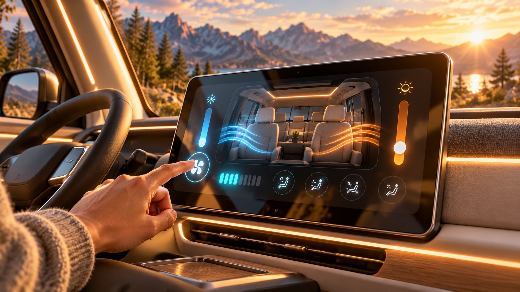
For years, the automotive industry has embraced an idea of digitalization built around visible reduction: larger displays, fewer switches, smooth surfaces and as many functions as possible inside one central user interface. It looks modern and is easy to market. But good UX does not automatically follow.
If a physical button is removed and its function is then buried two levels deep in a menu, the product has not been simplified. The complexity has merely been moved from the dashboard into the user’s head. Visual minimalism and functional minimalism are two completely different things.
Good interfaces do not primarily reduce the number of visible elements; they reduce the number of thoughts and interactions required. A user should have to think as little as possible about how to achieve a goal. Frequently used or safety-relevant functions therefore need to be treated differently from settings that may change once a month.
This does not mean modern vehicles need dashboards with fifty switches again. Quite the opposite. The strength of digital interfaces lies in their ability to present information contextually and prioritize functions intelligently. But for that to work, the interface has to be designed from the usage context, not from the question of how clean the cockpit looks in a product photo.
4 × 100 Four safety stages, each worth up to 100 points. In the new Euro NCAP system, the “Safe Driving” stage also evaluates HMI, comprehensibility and easily accessible controls. Euro NCAP 2026 ↗ID. Buzz Software Should Continue the Personality of the Car
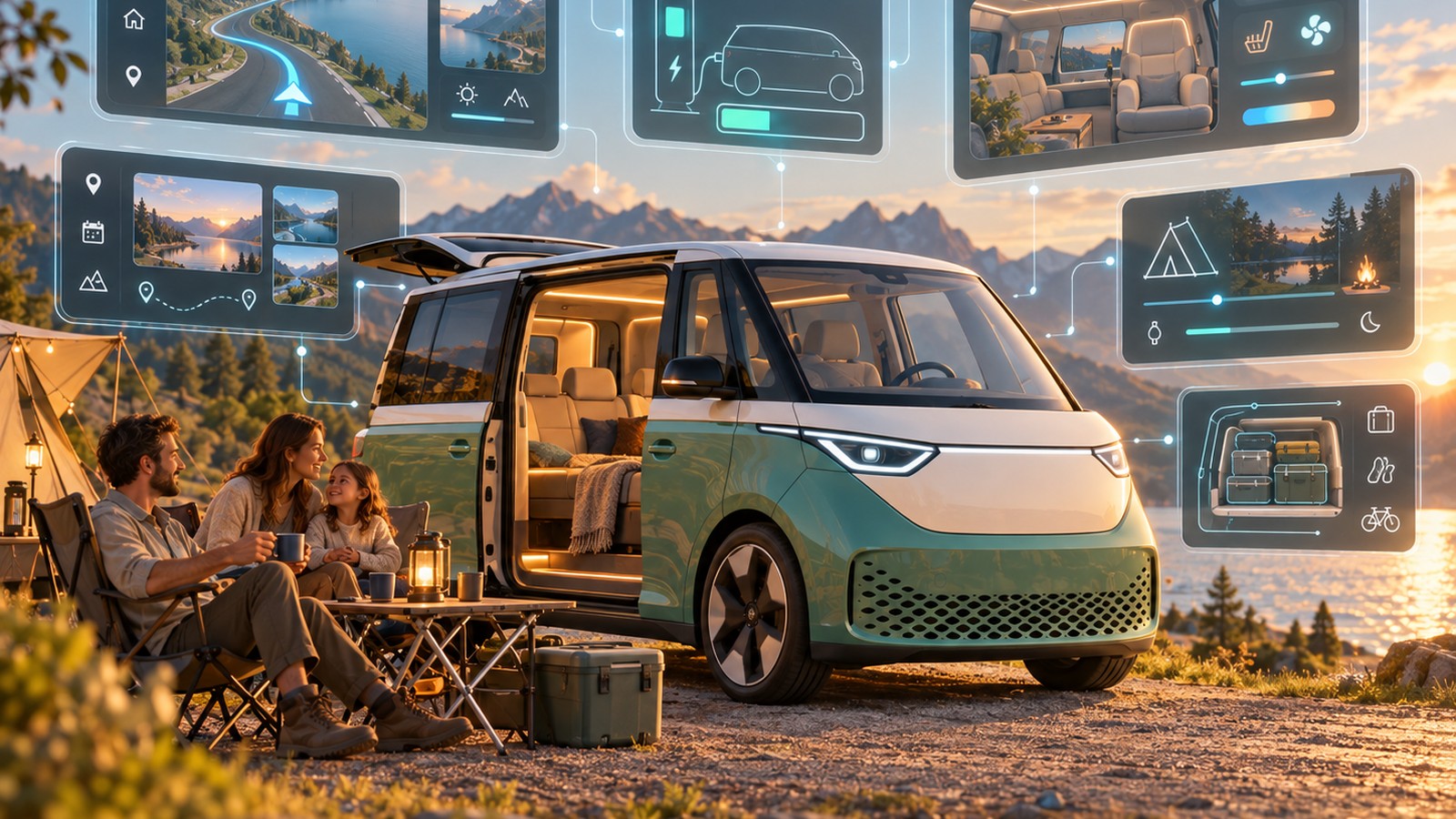
Something else stands out with the ID. Buzz. The vehicle has a very strong product identity of its own. It represents family, travel, leisure, space and, to some extent, camping and mobile living. The digital experience, however, carries this personality forward only to a limited degree. InsideEVs explicitly describes the software as largely carried over from the ID.4 and criticizes the lack of specific functions such as a camping mode.
This is exactly where a major difference could emerge. Why should the software of an ID. Buzz behave exactly like that of a compact electric vehicle? A vehicle with such a specific usage context could also have a correspondingly specific digital experience. Travel and camping functions, better family features, intelligent interior or climate modes and a closer connection between navigation, charging and stationary use would be obvious examples.
Buzz-specific software could, for example:
- offer a genuine travel or camping mode,
- intelligently combine climate, energy and charging for longer stays,
- take family functions and interior use into greater account,
- treat navigation, charging planning and leisure functions as one journey.
The key, however, would not be to add as many additional features as possible. That could make the problem even worse. The starting point should instead be: In which situations is this vehicle actually used, what tasks emerge from those situations, and how can software make them easier?
This is exactly where feature development differs from product design. The question is not: “What else can we add?” but: “What actually improves the user’s experience?”
Automotive UX Is Becoming a Decisive Part of the Vehicle
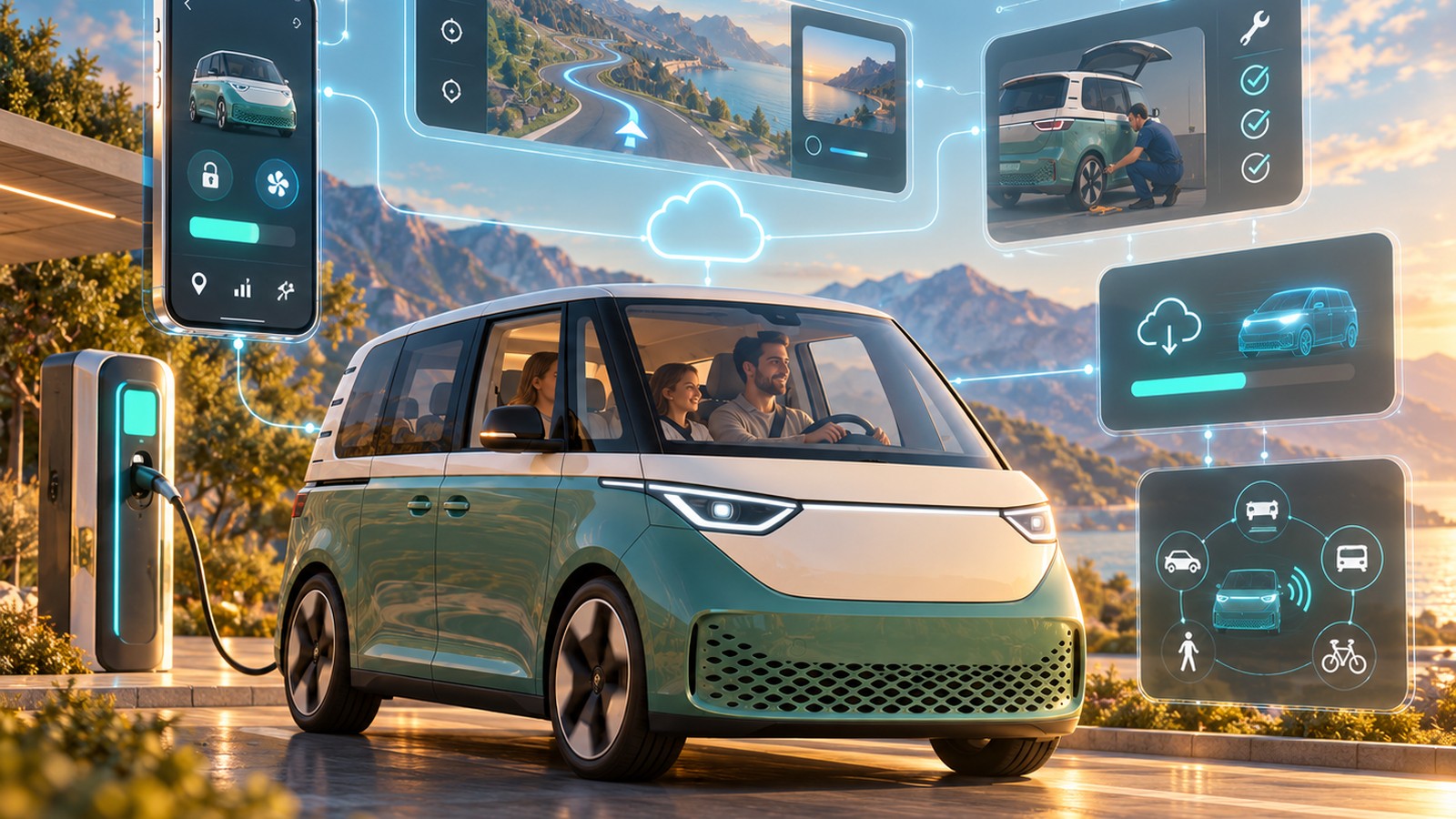
The hardware of modern cars is increasingly converging. Electric motors provide more than enough power, ranges are increasing, assistance systems are becoming standard and large displays are no longer a differentiator. Part of the competition is therefore shifting to another level.
Which vehicle understands its user better? Which system is immediately understandable? Which reliably remembers preferences? Which reduces unnecessary interactions? Which provides information exactly when it is needed? And which actually gets better over time through software updates?
Automakers are therefore not only transforming from combustion engines to electric vehicles. They are evolving from manufacturers of predominantly mechanical products into providers of complex, software-defined product experiences. Excellent engineers alone are no longer enough. This also requires strong product management, UX research, interaction design and software engineering — and teams that understand the car not as a collection of separate systems, but as one coherent customer experience.
- Product management that prioritizes usage situations instead of feature lists,
- UX research directly in the real driving context,
- interaction design for touch, voice and physical controls,
- software engineering that ensures speed, stability and updateability.
UX does not begin at the touchscreen. It begins when the vehicle is opened and does not even end when it is parked. Navigation, charging, app, climate control, assistance systems, media, service and hardware are one single product from the user’s perspective.
That is exactly why poor software can now undo part of what engineers and designers have developed brilliantly elsewhere. Customers do not distinguish between the chassis and the frontend team. They evaluate the experience as a whole. For companies, this has long become a question of UX & Design Leadership and Product Strategy: In the future, software will influence which cars we enjoy driving just as much as design, chassis or performance.